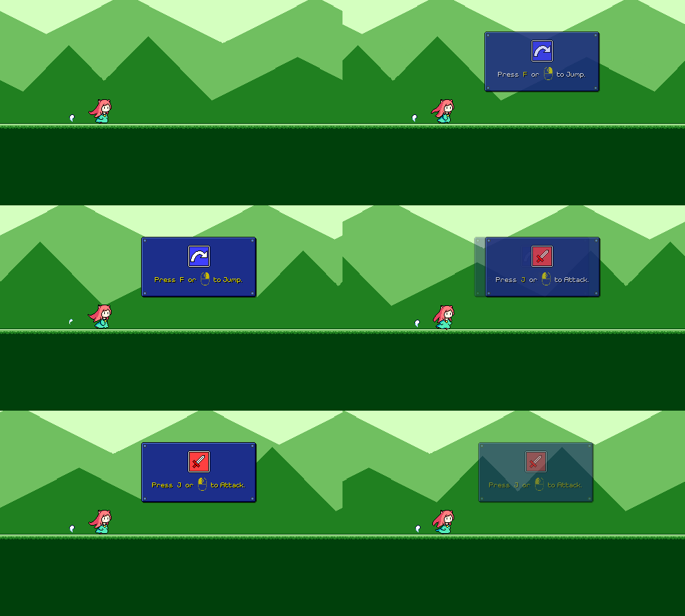
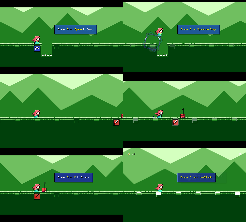
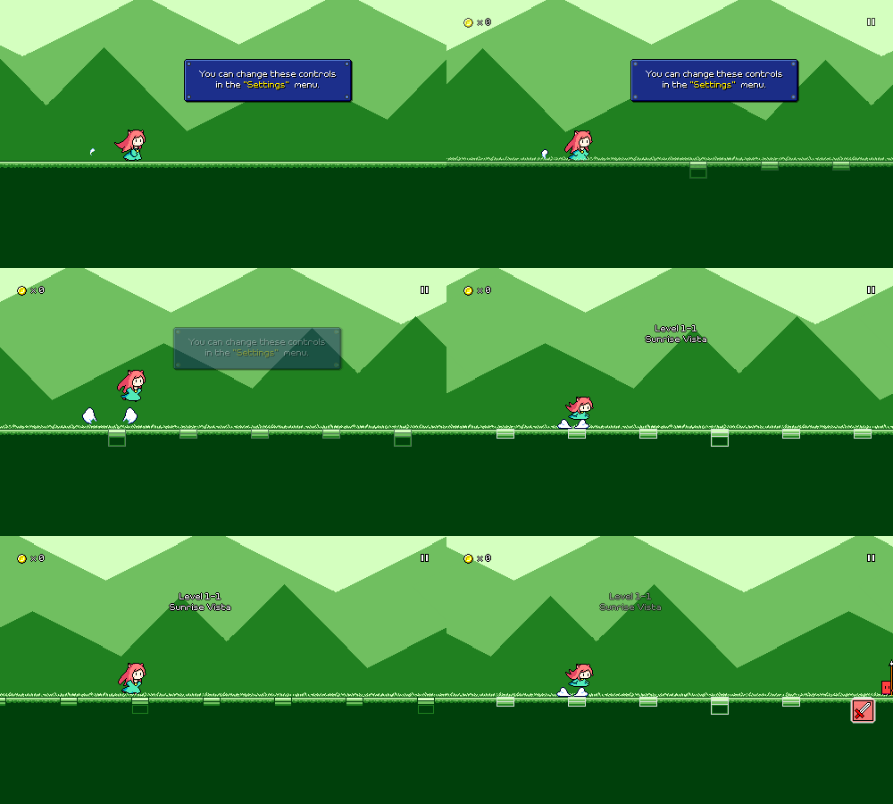
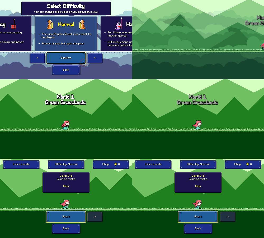
Devlog 78 - Unified Settings, Camera Smoothing, etc.
[p]Somehow the springtime always seems to be extra busy for me, and I ended up not really making much progress on Rhythm Quest last month due to having a million other things to worry about. I'm back at it, though, at least for now...[/p][h2]Unified Settings Menu[/h2][p]I've been somewhat dissatisfied with the overall organization of the settings menus for some time now. The design of each menu itself was pretty ok (I wrote about this in an early devlog), allowing for intuitive interaction with any control scheme:[/p][p]![]() [/p][p]
[/p][p]
[/p][p]However, as I've added countless different tweaks and options (there are over 60 in total so far, and I'm only making more as I go), separating them all into their own menus has proven to be cumbersome. I have something on the order of 20 of these different settings menus, because each menu can only hold about 4 or 5 rows worth of actual toggles (remember, buttons and text need to be readable and easily tappable even on a mobile device!). I've already had to divide these into "Settings" and "Game Mods", which itself is a distinction I've become less and less happy with:[/p][p]![]() [/p][p]
[/p][p]![]() [/p][p]
[/p][p]
[/p][p]Recently I tried to actually set some time aside to think of an alternative design where I could unify multiple settings menus into a single thing that you can navigate and flip through, instead of a bunch of disparate menus. If this were a desktop or console-only game I'd just have a big scrolling list, but I feel like that paradigm doesn't really work well when you use touch or mouse input. Instead I tried to have multiple horizontal "pages" that you can flip between.[/p][p]Here was my first attempt at a unified settings menu:[/p][p]![]() [/p][p]
[/p][p]
[/p][p]Looks relatively clean, though it introduces a few new issues. One is that there's just too many pages to flip through to find what you want. There's no sort of indexing or hierarchical structure, so it can feel like you're just paging through a million different screens without a good way to find something specific.[/p][p]I didn't want to go back to having a top-level menu, and I didn't have enough screen real estate to add another tab or index. Instead I tried to at show you the titles of the adjacent pages, so that you can navigate based on the headings:[/p][p]![]() [/p][p]
[/p][p]
[/p][p]I also show the adjacent pages with a lowered opacity, to give the impression that you're browsing through cards in a stack and give a visual indicator that there is something else to scroll to. Initially I had all of the pages wrap around in an infinite loop, but I actually decided not to do that as it felt more "anchored" to have an actual left "end" page or right "end" page to give you a reference point as to where each of the pages are individually within the list.[/p][p]With keyboard/gamepad input this all works really intuitively as it just navigates seamlessly between pages. With mouse/touch input you instead need to click on the left/right arrows directly to navigate. It's probably broken for screenreader input, but that's a battle I'll have to wage another day...[/p][p]As an added bonus, I'm taking this opportunity to make sure that I reuse as much of the same menu paging system for the in-game menu as well, instead of trying to organize that differently. There's still some adjustments that will need to be made there, but hopefully I won't need to manage two entirely different sets of menu pages...[/p][h2]Camera Smoothing[/h2][p]I've now implemented a simple algorithm for smoothing the vertical movement of the camera. Instead of directly tracking every height change in the track, it now interpolates so that height changes are anticipated slightly and are in general more "eased". Here's the before and after:[/p][p]![]() [/p][p]
[/p][p]
[/p][p]![]() [/p][p]
[/p][p]
[/p][p]I had to play around with this a bit before I decided that I liked it, but I'm pretty sold on it now. I was initially thinking of adding a new menu setting where you could adjust how much smoothing is applied, but I decided against that in the end -- I don't think this is the kind of thing that people need a choice for.[/p][p]Overall this is a minor change, but you can really notice it on certain track sections, and it also helps some issues that were present with the old implementation around very long airjump/flight sections.[/p][h2]Timing Indicator[/h2][p]This one has been on my to-do list for a while -- an (optional) visual timing indicator for more advanced players (or anyone looking to verify their calibration). I ended up implementing this in two ways; the first style is a fixed bar that stays in place on screen, with markers indicating how early or late you are on each successful obstacle interaction:[/p][p]![]() [/p][p]
[/p][p]
[/p][p]I also have an alternative version that you can use that displays the timing offset for every obstacle as you pass them. Not sure if this is really more readable, but it's an option![/p][p]![]() [/p][p]
[/p][p]
[/p][p]This is getting closer and closer to being able to have an (optional) traditional judgment system for your note timings. I want to be pretty deliberate about when or if I end up implementing this, as it could end up snowballing into a bunch of additional work (grading systems mean a more complicated result screen, adding more save data, etc.) for something that is intentionally not part of the core experience.[/p][h2]Fast Level Restart[/h2][p]Restarting a level now no longer reloads the level from scratch (if you want to do that you can still just quit the level entirely and then play it again). Instead, it keeps the level loaded and just gives you a respawn to the very beginning of the level, resetting all of the obstacles and coins. This is similar to the behavior that you get if you disable checkpoint respawns, and should help you out if you're trying to go for a high score but aren't using that toggle.[/p][p]![]() [/p][p]
[/p][p]
[/p][h2]Song Select Tweaks[/h2][p]The song select menu has been an interesting UI hurdle since it (along with the rest of the UI in the game) needs to handle multiple different input mechanisms. I previously implemented touch swipe controls for this list, but one downside of the existing UI is that you were only allowed to click on the currently-highlighted song. Clicking on any of the other ones would simply scroll it into the middle, which worked "OK" but not ideal.[/p][p]![]() [/p][p]
[/p][p]
[/p][p]I've reworked this so that you can simply click on any of the songs in the list to instantly ready it up. If you're using a mouse, the easiest way to navigate through the rest of the song list is to use a mouse wheel, but...of course, there's no guarantee you even have one of those (hi laptop/trackpad players?). To make sure everything is still sensible, I implemented a scrollbar on the right side of the list that you can click or drag:[/p][p]![]() [/p][p]
[/p][p]
[/p][h2]Game Start/Menu Flow[/h2][p]After some mulling over in my head, I ended up changing my mind and "Start Game" now takes you directly to the world select menu (except for a first-time player, where it takes you directly to level 1-1), skipping the difficulty selection screen. The difficulty selection screen is now accessed through the button on the top of the level select:[/p][p]![]() [/p][p]
[/p][p]
[/p][p]I previously thought that it was important to me to feature the difficulty selection screen before you start playing the game, but I'm backpedaling on that a bit because I feel like level 1-1 is probably going to be a fine experience for anyone regardless of skill level since you need to get introduced to the basic flow of the game anyways. The level 1-1 charts don't differ that much between easy/normal/hard anyways and after clearing that level you might have a better sense of whether you want to change up the difficulty. It's more important for me to get people into the game without getting bogged down with a bunch of menus![/p][p]Along that same vein, the audio calibration now starts up automatically instead of asking the player whether they want to do it (and recommending that they do). You can still skip it if you want, this is again just a way to eliminate one extra screen of reading and processing. The audio calibration UI itself still needs work (I've seen a lot of people fare really poorly on this screen), but that'll have to be a project for later...[/p][p]![]() [/p][p]
[/p][p]
[/p][p]And finally, the default sliding menu transitions can be skipped through if you simply hit a button an additional time, allowing you to navigate through the menus slightly faster if you want:[/p][p]![]() [/p][p]
[/p][p]
[/p][h2]Bugfixes and More[/h2][p]I've also been fixing a number of other random issues here and there, including the fact that I accidentally got rid of the nice pretty water effect for level 1-3 entirely (whoops). I also finally knocked out another todo item in that the water for level 1-3 now actually displays in the level select screen (it never did before):[/p][p]![]() [/p][p]
[/p][p]
[/p][p]There was also an interesting edge case that's been on my todo list for a while: double or multi-hit enemies that span across multiple checkpoints:[/p][p]![]() [/p][p]
[/p][p]
[/p][p]Previously this didn't work properly, as every enemy was assumed to only "belong" to one specific checkpoint. So if the last hit of a ghost enemy was just past a checkpoint, it wouldn't actually respawn correctly after you reached that checkpoint. But this now works properly and the ghost is reset to the correct state depending on where you are in the song. Works with double-hit enemies too, if they happen to cross over a checkpoint threshold![/p][h2]Issue Tracking[/h2][p]This isn't available publicly yet, but I've also started working on setting up a form for people to submit bug reports and issues via github:[/p][p]![]() [/p][p][/p][p][/p][p]Thinking about how to handle bug reports and issues has actually been on my mind for quite a few months now (right now there is just a scrappy #suggestions channel on the Rhythm Quest Discord which I'd like to eliminate). Initially I invested heavily into trying to create an in-game flow for submitting bug tickets -- I was implementing code that would automatically capture a game screenshot and then be able to upload it to a hosting site, then use the github API to create a ticket and link the attached screenshot.[/p][p]In-game bug reporting has some nice advantages in that you don't need to leave the game to report issues, and I can automatically include a bunch of information such as the build version and platform, and maybe even some relevant log output. But in the end I checked myself and felt like the effort I would need to invest to make a sensible UI for all of this didn't justify the benefits. I couldn't think of a way to really make the feature very discoverable either, so in the end I'm falling back to just using github issues to track this sort of stuff.[/p][p]You end up requiring a github account in order to file issues with this flow, but that isn't necessary a bad thing either. In the end I realized that I'm only a single person and even if I had a ton of bug reports coming it it's not like I would be able to timely address all of them anyways -- so it's to my advantage to choose a solution that's more prone to giving me a smaller number of quality issue tickets.[/p]
[/p][p][/p][p][/p][p]Thinking about how to handle bug reports and issues has actually been on my mind for quite a few months now (right now there is just a scrappy #suggestions channel on the Rhythm Quest Discord which I'd like to eliminate). Initially I invested heavily into trying to create an in-game flow for submitting bug tickets -- I was implementing code that would automatically capture a game screenshot and then be able to upload it to a hosting site, then use the github API to create a ticket and link the attached screenshot.[/p][p]In-game bug reporting has some nice advantages in that you don't need to leave the game to report issues, and I can automatically include a bunch of information such as the build version and platform, and maybe even some relevant log output. But in the end I checked myself and felt like the effort I would need to invest to make a sensible UI for all of this didn't justify the benefits. I couldn't think of a way to really make the feature very discoverable either, so in the end I'm falling back to just using github issues to track this sort of stuff.[/p][p]You end up requiring a github account in order to file issues with this flow, but that isn't necessary a bad thing either. In the end I realized that I'm only a single person and even if I had a ton of bug reports coming it it's not like I would be able to timely address all of them anyways -- so it's to my advantage to choose a solution that's more prone to giving me a smaller number of quality issue tickets.[/p]
[/p][p]However, as I've added countless different tweaks and options (there are over 60 in total so far, and I'm only making more as I go), separating them all into their own menus has proven to be cumbersome. I have something on the order of 20 of these different settings menus, because each menu can only hold about 4 or 5 rows worth of actual toggles (remember, buttons and text need to be readable and easily tappable even on a mobile device!). I've already had to divide these into "Settings" and "Game Mods", which itself is a distinction I've become less and less happy with:[/p][p]
[/p][p]Recently I tried to actually set some time aside to think of an alternative design where I could unify multiple settings menus into a single thing that you can navigate and flip through, instead of a bunch of disparate menus. If this were a desktop or console-only game I'd just have a big scrolling list, but I feel like that paradigm doesn't really work well when you use touch or mouse input. Instead I tried to have multiple horizontal "pages" that you can flip between.[/p][p]Here was my first attempt at a unified settings menu:[/p][p]
[/p][p]Looks relatively clean, though it introduces a few new issues. One is that there's just too many pages to flip through to find what you want. There's no sort of indexing or hierarchical structure, so it can feel like you're just paging through a million different screens without a good way to find something specific.[/p][p]I didn't want to go back to having a top-level menu, and I didn't have enough screen real estate to add another tab or index. Instead I tried to at show you the titles of the adjacent pages, so that you can navigate based on the headings:[/p][p]
[/p][p]I also show the adjacent pages with a lowered opacity, to give the impression that you're browsing through cards in a stack and give a visual indicator that there is something else to scroll to. Initially I had all of the pages wrap around in an infinite loop, but I actually decided not to do that as it felt more "anchored" to have an actual left "end" page or right "end" page to give you a reference point as to where each of the pages are individually within the list.[/p][p]With keyboard/gamepad input this all works really intuitively as it just navigates seamlessly between pages. With mouse/touch input you instead need to click on the left/right arrows directly to navigate. It's probably broken for screenreader input, but that's a battle I'll have to wage another day...[/p][p]As an added bonus, I'm taking this opportunity to make sure that I reuse as much of the same menu paging system for the in-game menu as well, instead of trying to organize that differently. There's still some adjustments that will need to be made there, but hopefully I won't need to manage two entirely different sets of menu pages...[/p][h2]Camera Smoothing[/h2][p]I've now implemented a simple algorithm for smoothing the vertical movement of the camera. Instead of directly tracking every height change in the track, it now interpolates so that height changes are anticipated slightly and are in general more "eased". Here's the before and after:[/p][p]
[/p][p]
[/p][p]I had to play around with this a bit before I decided that I liked it, but I'm pretty sold on it now. I was initially thinking of adding a new menu setting where you could adjust how much smoothing is applied, but I decided against that in the end -- I don't think this is the kind of thing that people need a choice for.[/p][p]Overall this is a minor change, but you can really notice it on certain track sections, and it also helps some issues that were present with the old implementation around very long airjump/flight sections.[/p][h2]Timing Indicator[/h2][p]This one has been on my to-do list for a while -- an (optional) visual timing indicator for more advanced players (or anyone looking to verify their calibration). I ended up implementing this in two ways; the first style is a fixed bar that stays in place on screen, with markers indicating how early or late you are on each successful obstacle interaction:[/p][p]
[/p][p]I also have an alternative version that you can use that displays the timing offset for every obstacle as you pass them. Not sure if this is really more readable, but it's an option![/p][p]
[/p][p]This is getting closer and closer to being able to have an (optional) traditional judgment system for your note timings. I want to be pretty deliberate about when or if I end up implementing this, as it could end up snowballing into a bunch of additional work (grading systems mean a more complicated result screen, adding more save data, etc.) for something that is intentionally not part of the core experience.[/p][h2]Fast Level Restart[/h2][p]Restarting a level now no longer reloads the level from scratch (if you want to do that you can still just quit the level entirely and then play it again). Instead, it keeps the level loaded and just gives you a respawn to the very beginning of the level, resetting all of the obstacles and coins. This is similar to the behavior that you get if you disable checkpoint respawns, and should help you out if you're trying to go for a high score but aren't using that toggle.[/p][p]
[/p][h2]Song Select Tweaks[/h2][p]The song select menu has been an interesting UI hurdle since it (along with the rest of the UI in the game) needs to handle multiple different input mechanisms. I previously implemented touch swipe controls for this list, but one downside of the existing UI is that you were only allowed to click on the currently-highlighted song. Clicking on any of the other ones would simply scroll it into the middle, which worked "OK" but not ideal.[/p][p]
[/p][p]I've reworked this so that you can simply click on any of the songs in the list to instantly ready it up. If you're using a mouse, the easiest way to navigate through the rest of the song list is to use a mouse wheel, but...of course, there's no guarantee you even have one of those (hi laptop/trackpad players?). To make sure everything is still sensible, I implemented a scrollbar on the right side of the list that you can click or drag:[/p][p]
[/p][h2]Game Start/Menu Flow[/h2][p]After some mulling over in my head, I ended up changing my mind and "Start Game" now takes you directly to the world select menu (except for a first-time player, where it takes you directly to level 1-1), skipping the difficulty selection screen. The difficulty selection screen is now accessed through the button on the top of the level select:[/p][p]
[/p][p]I previously thought that it was important to me to feature the difficulty selection screen before you start playing the game, but I'm backpedaling on that a bit because I feel like level 1-1 is probably going to be a fine experience for anyone regardless of skill level since you need to get introduced to the basic flow of the game anyways. The level 1-1 charts don't differ that much between easy/normal/hard anyways and after clearing that level you might have a better sense of whether you want to change up the difficulty. It's more important for me to get people into the game without getting bogged down with a bunch of menus![/p][p]Along that same vein, the audio calibration now starts up automatically instead of asking the player whether they want to do it (and recommending that they do). You can still skip it if you want, this is again just a way to eliminate one extra screen of reading and processing. The audio calibration UI itself still needs work (I've seen a lot of people fare really poorly on this screen), but that'll have to be a project for later...[/p][p]
[/p][p]And finally, the default sliding menu transitions can be skipped through if you simply hit a button an additional time, allowing you to navigate through the menus slightly faster if you want:[/p][p]
[/p][h2]Bugfixes and More[/h2][p]I've also been fixing a number of other random issues here and there, including the fact that I accidentally got rid of the nice pretty water effect for level 1-3 entirely (whoops). I also finally knocked out another todo item in that the water for level 1-3 now actually displays in the level select screen (it never did before):[/p][p]
[/p][p]There was also an interesting edge case that's been on my todo list for a while: double or multi-hit enemies that span across multiple checkpoints:[/p][p]
[/p][p]Previously this didn't work properly, as every enemy was assumed to only "belong" to one specific checkpoint. So if the last hit of a ghost enemy was just past a checkpoint, it wouldn't actually respawn correctly after you reached that checkpoint. But this now works properly and the ghost is reset to the correct state depending on where you are in the song. Works with double-hit enemies too, if they happen to cross over a checkpoint threshold![/p][h2]Issue Tracking[/h2][p]This isn't available publicly yet, but I've also started working on setting up a form for people to submit bug reports and issues via github:[/p][p]
