An Interview / The Level Design of Season
Hello fellow travellers!
Welcome back to our monthly blog posts, where we’ll be looking more in-depth into Season – and peek behind the curtain to see what inspires our team. We’ll be using this space to tell you more about our world, our characters and the talented team of individuals working on the game.
In this month’s instalment, we will be sharing a deep dive with Level Designer Oli Reeves about what goes into making a world fit for players to discover.
 Caption: Season [WIP / Alpha]
[h2]1. What considerations do you need to make as a level designer to keep things unique to Season’s Art style?[/h2]
In regards to Season’s art style and my approach to level design, two elements came to mind regarding our aesthetic: lighting and composition. Given that the art direction is driven by a variation of toon shading, we have only two nuances of lighting: shadow and light. This also affects the number of lighting options we can use to guide the player.
Under those circumstances, we have to reinforce other composition aspects to lead the player. We use strong focal points as attractors, leading lines to make the environment easily readable, and contrasting colours and movements to catch their attention. The stylised silhouettes of our structures work with our rich palette to create landmarks that can be seen from far away to influence our players’ path.
[h2]2. What inspiration do you pull from with your design recommendations?[/h2]
As with any creative effort, I love pulling references from real life to understand how things fit together. Whether from architecture, urbanism, or landscaping, you can’t ever go wrong by starting with references. Google is your best friend!
I’m fond of the principle of designing with intention. In other words, I first identify what our goal is, whether it is to lead the player in between two locations, guide the player toward an eye-catching landmark or tell a story within a given space. Once we have a goal set, we can then use paths, composition, shapes, VFX, sounds, and the rest of our LD palette to sell that goal we put in for ourselves.

 Caption: My Neighbour Totoro
On the artistic side, I lean on Ghibli-esque inspired visual style aesthetic. The pastoral environments and soothing compositions in My Neighbor Totoro and Ni No Kuni are full of inspiring ideas and anecdotal environmental moments, like a torii gate hidden among a bamboo grove or a rickety wooden bridge crossing an overgrown rivulet.
On the design side, I take inspiration from browsing concept arts, watching movie analyses and generally being a lover of the visual arts. There’s a lot to learn from the masters’ works, and looking is generally free!
[h2]3. How does one get into the field of level design?[/h2]
I believe there are several ways to become a level designer because this design field requires a vast array of skills, depending on the project. A background in architecture or urbanism can be valuable assets when creating believable environments; writing skills and narrative-focused minds help add context and stories through the layouts created; an eye for detail and an artistic education will lead to compositions that are easy to read and inviting for the player; technical knowledge in node-based programmings, such as Unreal’s Blueprints, helps create a prototype quickly and share your vision more concretely.
Lastly, but most importantly, adaptability and communication skills are key. Level designers are often the glue that binds all the other departments together since we are in charge of the playground. Being on the ground, level designers are the bridge between the art team in the world and the game design team.
[h2]4. How do cinematography techniques work into level design?[/h2]
Much like other visual media, the field of level design borrows heavily from composition and framing rules. We are creating a living tableau that the player can explore at their leisure. Techniques such as leading lines, use of colours and textures, rule of thirds, negative space, contrast and lighting, parallax, and framing are all skills that find their use in movies and video games. As Tony Zhou put it, every frame is a painting.
 Caption: My Neighbour Totoro
[h2]5. The “golden path” describes the main path developers want players to follow through a game. How do you determine what goes on that path and what goes to the sides?[/h2]
As I was ramping up on the project, I sat down with our narrative team to determine the flow of our map. In other words, we went over each location to determine their value for the world and the story we wanted to tell. We then determined what path they should take if we never wanted them to backtrack.
This process left us with a handful of minor locations that either told side stories or exposed complementary information to understand our world or our characters. I went over those locations to reinforce their themes and visuals to ensure that each one of them stood out. We want players to feel rewarded if they go off the golden path.
 Caption: Season [WIP / Alpha]
[h2]6. How do you get players to follow the golden path? Are there any tricks or methods you use?[/h2]
Players are often very curious and eager to explore the world. They can easily be diverted off the main path into side areas. To guide them through a more open map, they need to be able to figure their way around by using landmarks, much like in an attraction park. We can treat these landmarks as points of interest that the players will focus on, mostly out of curiosity but sometimes out of need. For instance, if a character informs them something is interesting at the lighthouse, players are likely to use it as a point of interest for their next destination. The path to these landmarks needs to be visible so players can plan their journey. On the way there, we strategically place side paths with clear forks in the road to give agency to the player. We make sure the path loops back to the main road they were on, with the landmark they were following in sight, so they can pick up where they left off!
[h2]7. How has technology, or new ways to develop games, changed how level design works and is implemented?[/h2]
One of the greatest technological advancements in our field in the last decade is the democratisation of game development. Game development is becoming more accessible with the help of node-based programming, asset stores and engines that have free versions. This makes it easier for new developers or students to get a good looking result straight out of the toolbox. Obtaining results fast allows them to test things out and explore ideas that otherwise wouldn’t fit in tight schedules.
When I graduated from college, several projects looked amazing, and we were proud to raise the bar from the previous cohorts. Less than a year later, students from the following cohorts were simply blowing us out of the water with the arrival of UE4. Their projects looked incredible, and so did the cohort after them and the one after that.
 Caption: The Last of Us Part Two
[h2]8. What are some of your favourite examples of good level design? What makes them good?[/h2]
Very much like food or music, taste in level design depends on each person and varies wildly from one game to another. My favourite level design decisions might not be everyone else’s cup of tea, and that’s perfectly fine.
That being said, I would say the series that has stuck with me the most in the last years in terms of level design is the reboot of the Hitman franchise. The amount of agency they give to the player and the richness of options and scenarios to reach and assassinate targets are astounding. IO Interactive delivered several playgrounds that fully exploit their game loop: explore, investigate, locate, assassinate and extract.
There are several other games I could name as honourable mentions, such as Red Dead Redemption 2 for its open-world design, The Last of Us Part Two for its impeccable use of lighting, framing and atmosphere, but the Hitman reboots are the games I feel have pushed the boundaries of level design as we know it.
 Caption: Hitman [2016] – Hokkaido, Japan
[h2]9. How does level design differ in games in different genres? Compared to other games, what considerations do you have to make for a game like Season?[/h2]
I find genres are an interesting question in video game culture. Unlike movies, where genres are usually determined by the feeling they aim to evoke, whether horror, romance, thrill, video games genre is often established by using their camera, like a first-person shooter, side-scrollers, third-person adventure. Some games even allow you to use vastly different cameras to play with. This and non-linear exploration or non-linear storytelling can create design challenges when guiding or pacing the player.
In the case of Season, our third-person camera and non-linear approach to world-building allow me to create picturesque environments ripe for exploration with the help of our art team, where I can hide interesting things in nooks and crannies based on the story intentions of our narrative team. I love the “organising the treasure hunt” part of level design.
 Caption: Season [WIP / Alpha]
[hr][/hr]
Thank you for taking the time to read our update! We’d love to hear your thoughts on our Discord, where you can talk to the developers, share your own inspirations, and learn more about Season. You’ll even get to see one extra level design mockup/WIP that we left out of this post!
Don’t forget that we also have a newsletter that will share some different information you won’t get in our blog posts! In our following missive, we’ll be talking about how our protagonist interacts with the world and how she records her travels.
Be safe in your journeys, and never forget.
With love,
Scavengers Studio
Welcome back to our monthly blog posts, where we’ll be looking more in-depth into Season – and peek behind the curtain to see what inspires our team. We’ll be using this space to tell you more about our world, our characters and the talented team of individuals working on the game.
In this month’s instalment, we will be sharing a deep dive with Level Designer Oli Reeves about what goes into making a world fit for players to discover.
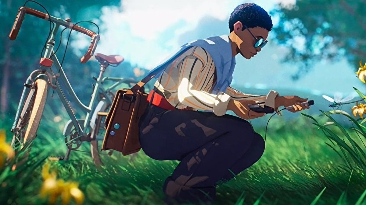
Caption: Season [WIP / Alpha]Questions with Oli!
[h2]1. What considerations do you need to make as a level designer to keep things unique to Season’s Art style?[/h2]
In regards to Season’s art style and my approach to level design, two elements came to mind regarding our aesthetic: lighting and composition. Given that the art direction is driven by a variation of toon shading, we have only two nuances of lighting: shadow and light. This also affects the number of lighting options we can use to guide the player.
Under those circumstances, we have to reinforce other composition aspects to lead the player. We use strong focal points as attractors, leading lines to make the environment easily readable, and contrasting colours and movements to catch their attention. The stylised silhouettes of our structures work with our rich palette to create landmarks that can be seen from far away to influence our players’ path.
[h2]2. What inspiration do you pull from with your design recommendations?[/h2]
As with any creative effort, I love pulling references from real life to understand how things fit together. Whether from architecture, urbanism, or landscaping, you can’t ever go wrong by starting with references. Google is your best friend!
I’m fond of the principle of designing with intention. In other words, I first identify what our goal is, whether it is to lead the player in between two locations, guide the player toward an eye-catching landmark or tell a story within a given space. Once we have a goal set, we can then use paths, composition, shapes, VFX, sounds, and the rest of our LD palette to sell that goal we put in for ourselves.
Caption: My Neighbour TotoroOn the artistic side, I lean on Ghibli-esque inspired visual style aesthetic. The pastoral environments and soothing compositions in My Neighbor Totoro and Ni No Kuni are full of inspiring ideas and anecdotal environmental moments, like a torii gate hidden among a bamboo grove or a rickety wooden bridge crossing an overgrown rivulet.
On the design side, I take inspiration from browsing concept arts, watching movie analyses and generally being a lover of the visual arts. There’s a lot to learn from the masters’ works, and looking is generally free!
[h2]3. How does one get into the field of level design?[/h2]
I believe there are several ways to become a level designer because this design field requires a vast array of skills, depending on the project. A background in architecture or urbanism can be valuable assets when creating believable environments; writing skills and narrative-focused minds help add context and stories through the layouts created; an eye for detail and an artistic education will lead to compositions that are easy to read and inviting for the player; technical knowledge in node-based programmings, such as Unreal’s Blueprints, helps create a prototype quickly and share your vision more concretely.
Lastly, but most importantly, adaptability and communication skills are key. Level designers are often the glue that binds all the other departments together since we are in charge of the playground. Being on the ground, level designers are the bridge between the art team in the world and the game design team.
[h2]4. How do cinematography techniques work into level design?[/h2]
Much like other visual media, the field of level design borrows heavily from composition and framing rules. We are creating a living tableau that the player can explore at their leisure. Techniques such as leading lines, use of colours and textures, rule of thirds, negative space, contrast and lighting, parallax, and framing are all skills that find their use in movies and video games. As Tony Zhou put it, every frame is a painting.
Caption: My Neighbour Totoro[h2]5. The “golden path” describes the main path developers want players to follow through a game. How do you determine what goes on that path and what goes to the sides?[/h2]
As I was ramping up on the project, I sat down with our narrative team to determine the flow of our map. In other words, we went over each location to determine their value for the world and the story we wanted to tell. We then determined what path they should take if we never wanted them to backtrack.
This process left us with a handful of minor locations that either told side stories or exposed complementary information to understand our world or our characters. I went over those locations to reinforce their themes and visuals to ensure that each one of them stood out. We want players to feel rewarded if they go off the golden path.
Caption: Season [WIP / Alpha][h2]6. How do you get players to follow the golden path? Are there any tricks or methods you use?[/h2]
Players are often very curious and eager to explore the world. They can easily be diverted off the main path into side areas. To guide them through a more open map, they need to be able to figure their way around by using landmarks, much like in an attraction park. We can treat these landmarks as points of interest that the players will focus on, mostly out of curiosity but sometimes out of need. For instance, if a character informs them something is interesting at the lighthouse, players are likely to use it as a point of interest for their next destination. The path to these landmarks needs to be visible so players can plan their journey. On the way there, we strategically place side paths with clear forks in the road to give agency to the player. We make sure the path loops back to the main road they were on, with the landmark they were following in sight, so they can pick up where they left off!
[h2]7. How has technology, or new ways to develop games, changed how level design works and is implemented?[/h2]
One of the greatest technological advancements in our field in the last decade is the democratisation of game development. Game development is becoming more accessible with the help of node-based programming, asset stores and engines that have free versions. This makes it easier for new developers or students to get a good looking result straight out of the toolbox. Obtaining results fast allows them to test things out and explore ideas that otherwise wouldn’t fit in tight schedules.
When I graduated from college, several projects looked amazing, and we were proud to raise the bar from the previous cohorts. Less than a year later, students from the following cohorts were simply blowing us out of the water with the arrival of UE4. Their projects looked incredible, and so did the cohort after them and the one after that.
Caption: The Last of Us Part Two[h2]8. What are some of your favourite examples of good level design? What makes them good?[/h2]
Very much like food or music, taste in level design depends on each person and varies wildly from one game to another. My favourite level design decisions might not be everyone else’s cup of tea, and that’s perfectly fine.
That being said, I would say the series that has stuck with me the most in the last years in terms of level design is the reboot of the Hitman franchise. The amount of agency they give to the player and the richness of options and scenarios to reach and assassinate targets are astounding. IO Interactive delivered several playgrounds that fully exploit their game loop: explore, investigate, locate, assassinate and extract.
There are several other games I could name as honourable mentions, such as Red Dead Redemption 2 for its open-world design, The Last of Us Part Two for its impeccable use of lighting, framing and atmosphere, but the Hitman reboots are the games I feel have pushed the boundaries of level design as we know it.
Caption: Hitman [2016] – Hokkaido, Japan[h2]9. How does level design differ in games in different genres? Compared to other games, what considerations do you have to make for a game like Season?[/h2]
I find genres are an interesting question in video game culture. Unlike movies, where genres are usually determined by the feeling they aim to evoke, whether horror, romance, thrill, video games genre is often established by using their camera, like a first-person shooter, side-scrollers, third-person adventure. Some games even allow you to use vastly different cameras to play with. This and non-linear exploration or non-linear storytelling can create design challenges when guiding or pacing the player.
In the case of Season, our third-person camera and non-linear approach to world-building allow me to create picturesque environments ripe for exploration with the help of our art team, where I can hide interesting things in nooks and crannies based on the story intentions of our narrative team. I love the “organising the treasure hunt” part of level design.
Caption: Season [WIP / Alpha][hr][/hr]
Thank you for taking the time to read our update! We’d love to hear your thoughts on our Discord, where you can talk to the developers, share your own inspirations, and learn more about Season. You’ll even get to see one extra level design mockup/WIP that we left out of this post!
Don’t forget that we also have a newsletter that will share some different information you won’t get in our blog posts! In our following missive, we’ll be talking about how our protagonist interacts with the world and how she records her travels.
Be safe in your journeys, and never forget.
With love,
Scavengers Studio