1. Techtonica
  2. News

Techtonica News

Installing fresh lights for Techtonica’s launch💡

Welcome, Groundbreakers!

This week’s post is a little on the lighter side compared to our usual, but we hope you find it illuminating.

I can’t promise that those will be the last of the horrible puns in this update, but I will apologize for them. I’m sorry.

As we march towards the Early Access launch of Techtonica, we’re making lots of updates to stuff like optimization and tweaking items and basic recipes. At this stage, we’re not really adding new content to what will be available at the launch.


But! We did want to take time to update the light sticks before the game’s ready for players. That’s what we’re exploring today. We’ll showcase the new lights, compare them to the old lights, and talk a bit about why we wanted to get them upgraded ahead of launch.

Let’s dig in!

[h3]Hey, who turned on the lights??[/h3]

These are the new light sticks in Techtonica.


The light sticks stand at two voxels high and one voxel wide. They come in white, red, blue, and green (for streamers, of course), and they are additive in nature.

What do I mean by additive? The colors of the light that shines off of the sticks change based on the light mix nearby. Combine blue and red light sticks in a close area to get a purple shine. See that below.


[h3]The lights we lost…[/h3]

The light sticks that these fresh ones replace were, much like other things early in development, placeholder lights. The asset was temporary, as you can tell, and the design work done on them was incredibly basic.

Here’s what the lights looked like before this internal update.


[h3]Why the rework?[/h3]

Oftentimes, teams like ours have limited resources when it comes to tackling projects like updating light sticks. As we move towards Early Access launch, there are some elements of Techtonica that we’re comfortable with releasing in a work-in-progress state. These elements function as intended, but they will be improved as development progresses.

So, why did we tackle the light sticks ahead of launch? The main sources of light in Techtonica are plants, machines, and bioluminescent water. With Power Floors down, plants harvested, and factory construction in far-off corners, the subsurface world can get dark, quickly.


We overhauled the light sticks because we know players will want to replace the natural light with something they physically build and place. We wanted a strong set of options for lighting at Early Access launch, including a selection of colors.

Techtonica will evolve through Early Access, of course, and we have so many plans for lighting and factory decoration that we can’t wait to share.

Thanks for reading, Groundbreakers!

While you’re here, don’t forget to Wishlist Techtonica!

https://store.steampowered.com/app/1457320/Techtonica/

Your feedback improved Techtonica's opening moments

Wake up, Groundbreaker. While you were sleeping, we completely changed your cryo pod. In fact, we’ve changed a ton about Techtonica since the demo, especially where you wake up.

Lots of this happened after we took a good look at the player feedback from in-person demos and across places like the Steam Forums and our Discord. The central theme was that the opening section tried to do too much over a short span.

In today’s post, we’ll briefly explore the starting area of Techtonica as it stands in the demo. Then, we’ll move into the starting area that you’ll see at Early Access launch later this year.


This new area features a complete overhaul, and we’ll detail how we shaped this new space and share some of the basic modeling and asset work required to get it right.

Let’s dig in.

[h3]The demo space is old news[/h3]

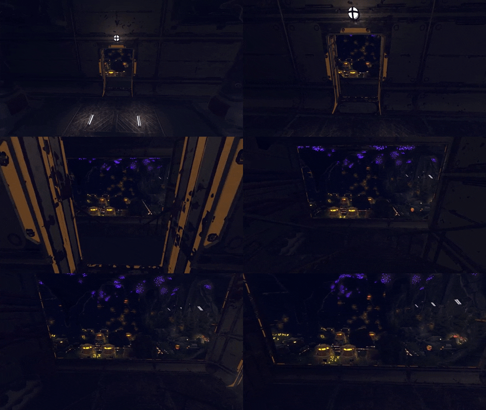
Here’s a quick flythrough of the space as it exists in the demo.


Notice the basic cryo pods, the Crank Generator placement tutorial space, picking up Sparks, the voice-activated door, and the example factories? All of that has changed.

We wanted to cut down on the time it took to get into the real gameplay of Techtonica, and that happened thanks to a drastic redesign of this opening moment.

[h3]And here’s where you’ll wake up at launch[/h3]

You’re still waking up from cryostasis, but the facility around you has completely changed. It’s smaller, has no Sparks, no Crank Generator puzzle, no voice-activated door, and the distance between where you wake and PT LIMA is much shorter.

The result is a tighter tutorial area that quickly brings players up to speed with the story before setting them free.


If you remember the demo, then you remember the long hallway of small example factories that you walk by on your way to the Pickaxe and the locked door. That hallway was put in place thanks to some very, very early playtest sessions.

The early testers weren’t necessarily fans of factory games, just games in general. Without a broader sense or understanding of what Techtonica is, they’d go into the game without knowing that they should be building Miners to mine, Inserters to grab, or Conveyors to transfer. We created these example factories to bring players up to speed quickly.

And it worked really, really well.

So, you’ll see an example factory that you absolutely cannot miss once you leave the cryo pod, but the moment is much faster and more obvious.


[h3]Finding the right frozen look[/h3]

This is very inside baseball, but we figured you’d like a look at how teams like ours sometimes use pre-made assets to get a headstart on work and make development move a little faster.

The art team was tasked with polishing the tutorial experience. We wanted a cryo pod that we could position vertically, so all the player has to do is step out of it. We also wanted an asset that we could retexture to bring more in style. After we bought the asset, we did some layouts to test.


With the layout approved, the art team did a texture pass to get the cryo pod in line with the color scheme and materials of the facilities. We also did work to get a frosted material on the cryo pod glass to sell the cold environment, in addition to some color tweaks. Here’s more of that process.


Thanks for reading, Groundbreaker.

We’ll be back next week with another deep dive into Techtonica. Until then, come hang out in our Discord.

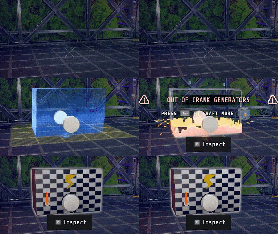
Oh! Bonus GIF for the Alpha Groundbreakers among us. Remember Cranky?


https://store.steampowered.com/app/1457320/Techtonica/
Redesigning our Research Cores to be 👀mesmerizing👀

One of Techtonica’s core (pun intended) gameplay pillars is unlocking and upgrading tech. You do that through scanning and research. Research Cores are the research currency in Techtonica.

In order to unlock tech on your tech tree, you’ll need the right count and color of Research Cores. They must be built and placed to count toward your tech tree, too.


We had these Research Cores in the demo, too! But the asset back then was temporary, and we knew we needed to overhaul them before launch.

What do they look like now? How did we get here? Do we have any hints about the full functionality?

Dig in, Groundbreaker.

[h3]Remember the Cores from the demo? Well...[/h3]

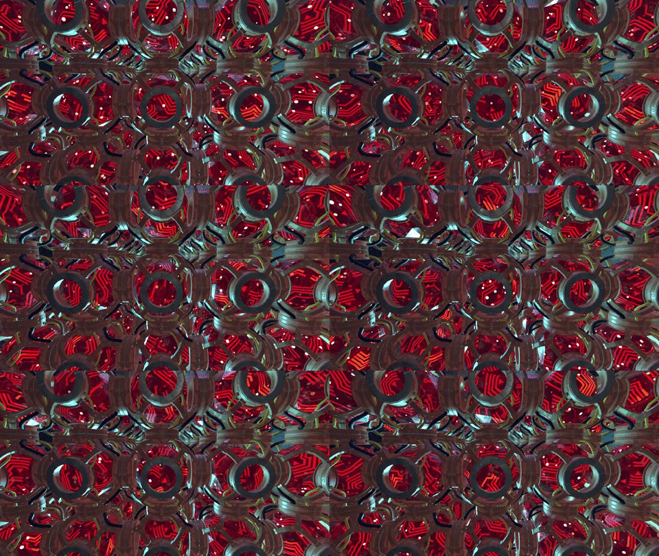
The Research Cores players built in the demo were pretty basic! They were a placeholder asset that we leaned on to get the Alpha and demo out the door for player feedback.

We wanted these things to do lots more, but here’s what they used to look like.


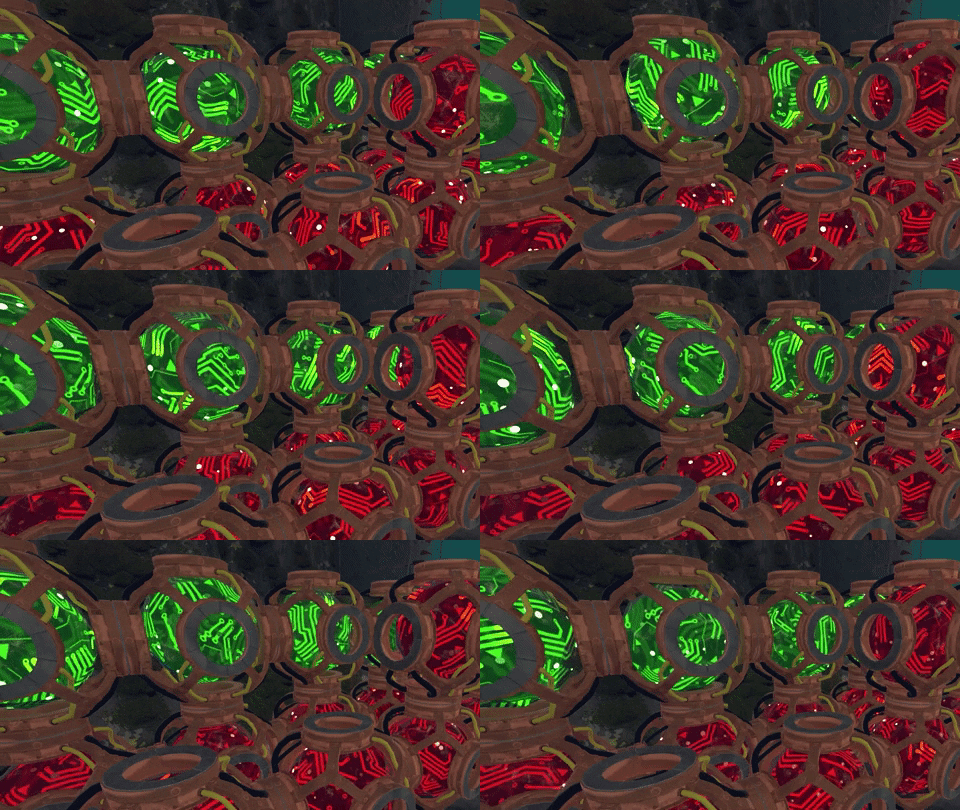
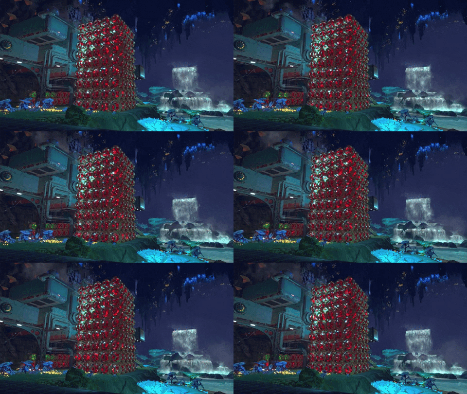
And here’s what they look like now.


Research Cores are bigger, have a completely distinct look and feel, and we worked to give them a mesmerizing motion.

Yes. We upgraded the thing that you’ll use to make your own upgrades. The irony is not lost on us.

[h3]Finding the right look and feel for Research Cores[/h3]

We started designing the look for the Research Cores with a relatively straightforward desire in place. We wanted a framework design that showed off the core and provided a six-way connection. Here are some early 2D takes.


We wanted the Cores to feature a glowing circuit pattern that was super pleasing to look at for players. So we took some of these illustrations and worked them up in 3D.


We landed close to version E in the sketch above.


[h3]A hint at what’s to come…[/h3]

We’re not really ready to share all the fancy things that come with the Cores. We will say this, though.

We want to enable players to eventually automate just about everything in Techtonica. That’s true for Research Cores, too, and there may be one more machine in the relatively near-future pipeline.


We’ll share this new machine in a post as we get closer to launch.

Thanks for reading this week’s update, Groundbreakers! We’ll see you next week with more.

Want to talk Techtonica and factory games in general? Join our Discord.

Introducing the ModPack, an upgradeable, modular backpack

Say hello to your ModPack!

This modular backpack is worn by all Groundbreakers on Calyx, and you’ll be able to enhance it with upgrades like the Hover Mod.


In today’s post, we’ll share screenshots and GIFs of the ModPack. We’ll talk a bit about how it functions and fits into the universe of Techtonica. And, of course, we’ll share some concept art to highlight the development process.

As always, Techtonica is in active development. The ModPack’s design and effects can change over time.

Let’s dig in!

[h3]Your ModPack’s alive with science![/h3]

The ModPack in Techtonica is home to all sorts of functionalities for the Calyxian-bound Groundbreaker.

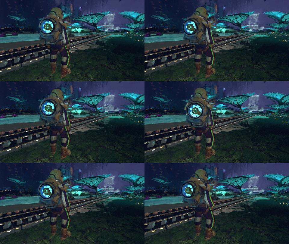
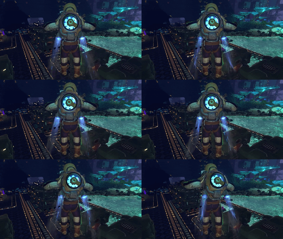
Here’s how the pack looks in Techtonica. It’s rad.


The ModPack is a standard issue all-in-one backpack for ANEXCAL’s Groundbreakers. It’s a power supply for equipment, it holds the Groundbreaker’s lamp, and it’s the bottomless inventory system.

It’s also extensible with mods you’ll find throughout Calyx. The Hover Mod upgrades the ModPack’s thrusters, for instance, to enable flight at a consistent elevation above the ground.


A backpack was always intended for the complete design of the character. You can't have a Soviet-inspired, atomic-age video game cosmonaut without one.

How did we get here?

[h3]Concepting the shape and feel of the backpack[/h3]

Early in development, the ModPack was just going to hold your inventory. It evolved to also act as a generator for the M.O.L.E.. Then it became the way we allow players to hover and travel short distances quickly. We figured the sky (or cavern ceiling?) was the limit from there.

Here’s a look at some very early concepts.


We always look for ways to add emission (glow) and motion that align with our story and aesthetic. Arc and fusion reactors combined with old-school radial engines have a cool, sci-fi, industrial look that helps us tell the story of Techtonica's mysterious and powerful technologies.

As the ModPack evolved, we got to work with these elements.


[h3]A future of ModPack add-ons[/h3]

Over time, the ModPack worn by Groundbreakers will change with add-ons.

Here’s some concepting for how the RailRunner will work as a ModPack add-on.


The RailRunner (how players ride on the Monorail System’s rails) will be incorporated directly into the ModPack’s equipment set, just like the lamp and Hover Mod. It looks cool, first of all, and it makes a heck of a lot of sense in the context of the game.


We can’t wait to see you parading around Calyx with your own ModPacks once Techtonica hits Early Access later this year.

If you’d like these blog posts sent directly to your mailbox in newsletter form, sign up for our mailing list right here!

If hanging on a Discord is more your jam, you can join ours here.

Until next week, Groundbreakers.

https://store.steampowered.com/app/1457320/Techtonica/
Techtonica’s UI overhaul features a new Notification Center

Building the User Interface in a game like Techtonica is its own unique challenge.

There’s so much information happening all at once in a factory automation game as players explore, research, build, and upgrade their factories.


Add in multiplayer? Well, that introduces a whole host of fresh challenges for how and where to place information.

Today, we’ll dive a little deeper into the evolving UI for Techtonica, touch on what was present in the demo, share how we’re showcasing information today, and give you a glimpse into the UI of tomorrow.

Before we start! This is all super work in progress. Understand that Techtonica’s UI is in-development and that a lot can and will change both before release and during Early Access. Cool?

Let’s dig in.

[h3]But first! A look at the Notification and HUD UI from the demo[/h3]

If you’ve played Techtonica’s demo, then you're familiar with the temporary UI that’s in place. We know it’s cluttered and a bit hard to digest. We poke fun at ourselves about it, too, but programmer art UI is how games get up and running.

Let’s take a look at a screenshot that gives us a good chuckle. Here, we’ve just scanned our first Smelter and are greeted with what’s basically a dump truck of on-screen information.


Yikes.

The demo was essentially the Alpha of Techtonica. It’s early days stuff, so we totally get it. There’s too much on screen, and it’s hard to really parse what matters and what doesn’t. If we let that stand as our baseline, how do we improve?

Well…

[h3]Addition by subtraction[/h3]

We start with reduction and simplification. All of those notifications that flew through the center of the player’s view during the demo? They have been pushed up below what we’re calling the Notification Center (more on that in a second).

This single, convenient stream of information is a hub for all of what each player is actually doing. If you’re gathering plants, we detail what and how much in a small notification. If another of your friends scans and unlocks new equipment, we share that information along with their Steam name.


It’s so much cleaner.

This reduction in clutter makes it easier to spot notifications and pick up on bigger, more important cues.

[h3]Easier access to what you care about most in a given moment[/h3]

You’ll notice at the top of the refreshed HUD is a collection of icons and shortcuts. Each icon will have a notification counter on it as Groundbreakers unlock new tech, dialogue, and quests. Hit the shortcut key, and you’ll dive directly into the menu with the notification.

We wanted a way to gather waiting notifications for players without pestering them. Now, when you want to explore what’s new in your journal, you can do it at your leisure without a massive block of text flying over the middle of the screen.


Those shortcuts, of course, will change if you ever rebind your keys. Don’t worry.

More urgent notifications will get priority billing beyond just a number above one of those icons. We’re looking to expand the roster of urgent notifications, too. Power failures, for instance, will be easier to spot as we continue to improve the UI.

[h3]A peek at the HUD in Techtonica’s tomorrow[/h3]

We have more coming in the UI, too! Our art team mocks up additions and changes as we design and concept new machines and functionalities.

Here are a couple of those mock-ups for you to peruse and consider. Not all of this stuff will come to Techtonica, but it is cool to see what we’re cooking and trying on for size as development moves into and through Early Access.


Thanks for reading, Groundbreakers!

If you’d like to chat more about the UI or what’s coming to Techtonica, join our Discord.

Until next week.

https://store.steampowered.com/app/1457320/Techtonica/