1. Factorio
  2. News

Factorio News

Friday Facts #352 - New website

Read this post on our website.

New website (Sanqui)

Over the course of the past year, you have seen the team put a lot of effort into polishing the game to get it ready for a full release. There's no doubt this is the most important effort here: we're all here to play the game. At the same time, the website is often the first thing people encounter—and in for many, return to every week! Unfortunately, until this point the looks of our websites have been neglected. The current set of websites are a complete mishmash of styles that are not coherent and do not fit with the look of the game.

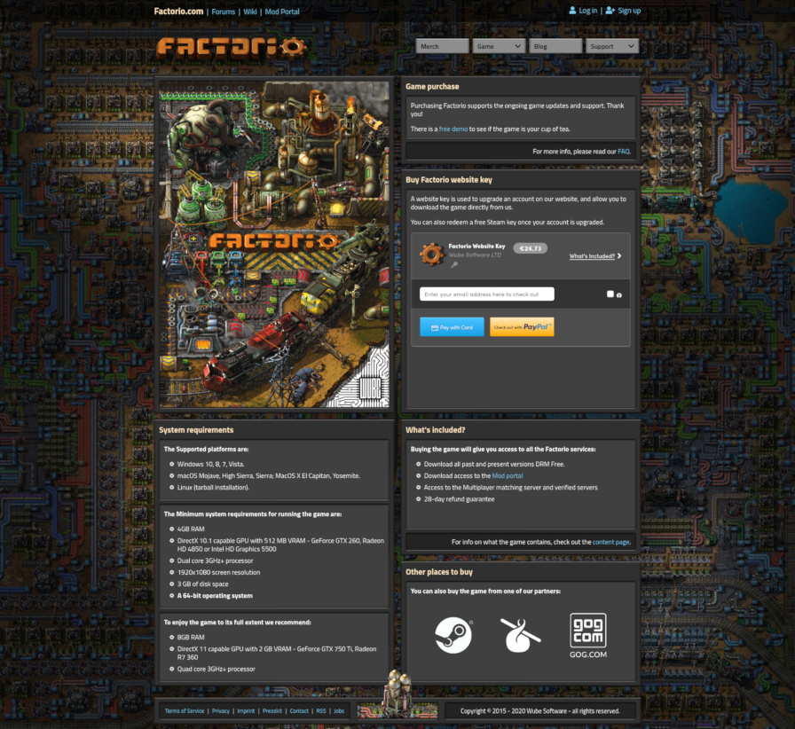
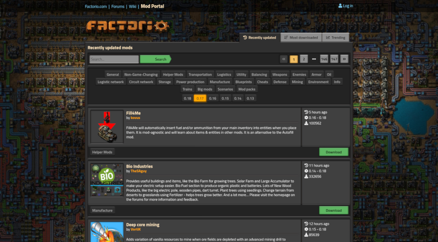
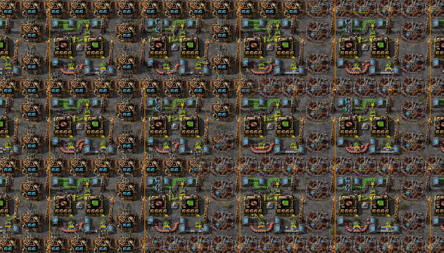
Which website am I looking at again?

We set out to rework the looks of our websites last year to make them harmonize with the final game.

Albert and Aleš worked together to design the new website and make mockups in a process not too dissimilar to the GUI work in the game. Of course, web technology is a different beast from anything the game uses. My task was to take the mockups for each page and implement them as closely as possible (my own creative liberties notwithstanding).

The process from original page to mockup to the new version

My approach to creating websites is conservative, and in a way mirrors the philosophy we use when developing the game. The Factorio website doesn't use a fancy modern JavaScript framework. I'm not a JavaScript hater. There is no harm in using JavaScript to make parts of the website interactive, and of course many web applications wouldn't be possible with it. But for a website like ours, avoiding the use of bloated JavaScript frameworks helps keep everything load and render quickly, and of course the website can be browsed without JavaScript as well.

To get the looks right, I set out to create a CSS framework to visually mimic the Factorio GUI style. Where possible, I avoided the use of images. This keeps the page fast and ensures it stays sharp on all resolutions and levels of zoom.

For instance, the buttons match their game counterparts closely, but are made only using shadows.


The only exception is the arrow facing to the right, which simply isn't possible to reproduce using CSS (I tried!). However, even then the performance is kept slick because the graphics for it are embedded in the stylesheet.

The layout for new pages with sleek grids is enabled thanks to modern CSS technologies like Flexbox and CSS grid (no floats, no tables).


At the same time, the mod portal also received the new design.


I also took the effort to unify login sessions between the main website and the mod portal, so you no longer have to log in twice.

This Friday Facts is the last time you're seeing the current (old) style, so enjoy it while it lasts! The new website will go live sometime next week. Once the new design is out, don't forget to click on the rocket!


Website content update (Klonan)

My part in the website update was going through all the pages and updating the content, with a side goal of reducing overall the number of pages we have, either by merging pages or just deleting pages we no longer value.

Since 1.0 is so close, I decided to just 'pretend' that 1.0 is already out, and update the content to match it. That means there is no mention of early access, ongoing development, roadmaps, alpha releases, etc. This allowed me to clean up quite a lot of the pages, and make them much neater and more clear. This might cause some confusion until 1.0 is actually released, but that's just 2 months away now, so its not a big concern for me.

[h3]Artwork page[/h3]
While going through the Presskit, I found myself wanting to include some of the 'cool' images that we've made over the years that aren't really screenshots. Things like the 2020 Rocket poster, or the Player and the biter giving a toast the new year.

Initially I thought I would just throw them in the Presskit page willy nilly, and that will get them out there. We have some really nice images that are good for things like Youtube thumbnails, Website articles and reviews, etc. so I really wanted them to be accessible at least somewhere. However having them only on the presskit might mean they aren't really discoverable to the average player or new website visitor.

So I decided to add a brand new page, the Artwork page. Initially I just added the nice flashy posters, the 2020 rocket, GDS cover, etc. but I figured there are lots of interesting images we can include from the years of publishing the FFFs. So I went through all the 350+ blog posts, to try to find the best images to put up on the page. I wanted to avoid images that shows old graphics or potentially confusing/outdated information.


It feels like this Artwork page is a great showcase of all the work we've done over the years, and I am really happy with how it turned out. Gathering the best images and compiling them into the single page, it started to seem like we really are reaching the finish line, and we will have some closure on the alpha development. Its been a long journey, and while we have a lot to look forward to with Factorio development, part of me feels a bit sad knowing this chapter of the game is drawing to a close.

Version 0.18.32 released

Graphics


  • New beacon graphics.
Features


  • Changed fluid mixing to a simpler version that only checks when manually building most things.
  • Added a flush fluids button to the pipe, underground pipe, and storage tank entity GUIs.
Gui


  • Show only unlocked items in filter selection (inventory and quickbar) and logistic/trash requests. Other selections like signal selection/upgrade selection are not affected. New interface settings (off by default) bypasses this and allows the player to see all items as before.
  • When selecting an element from a slot that has already value, the selected value is now going to be highlighted with the related tab (if applicable) selected.
Bugfixes


  • Fixed a few weird pixels in heat exchanger East sprites. more
  • Fixed player mining animation had the backpack affected by the color mask. more
  • Fixed mining drill status after disconnecting it from logistic network. more
  • Fixed massive script time usage in Wave defense scenario after configuration changes. more
  • Fixed that infinity GUI filters didn't list all items.
  • Fixed issue with upgrading ghost of assembler with pipes. more
  • Fixed new electric mining drill was missing integration layer. more
  • Fixed crash when unit group is destroyed while its goto behavior is being updated. more
Modding


  • Changed beacon graphics definitions. Graphics are now defined in graphics_set prototype property. If graphics_set is not defined, old animation and base_picture properties will be loaded instead for limited backwards compatibility.
Scripting


  • Added LuaFluidBox::flush().
  • Added LuaPlayer::auto_sort_main_inventory read.


You can get experimental releases by selecting the '0.18.x' beta branch under Factorio's properties in Steam.

Friday Facts #351 - Beacon re-redesign Simplified fluid mixing

Read this post on our website.

The Beacon Redesign (V453000)


The Beacon is one of the last entities that don’t have high resolution graphics yet. In the rather recent FFF-339, Albert presented the updated and redesigned Beacon. After your responses we realized some issues we hadn’t seen with the Beacon before, and we have taken some time to think about it...


The red tower design by itself is very impressive, which gave it so many plus points that we didn't focus enough on the fact that it is taking too much visual attention. In this case, this happens because of aggressive red colours, the big contrasty yellow eye-like circle, the entity being quite tall, and the electric beam animation. Random variations are usually helpful to make entities look nicer in clumps (like resources), but not in this case, especially as other built entities don’t have any variations.

The options to take from here would be to either update the original design, adjust the red tower, or start a new redesign.


The Beacon is a very special entity, either it doesn’t appear in a factory at all or very little, or it’s everywhere. It doesn’t really do anything by itself so it doesn’t really need to show much activity either.

The original design has its own problems and also saturates the screen very quickly, as they are bright, also tall, and they always move, attracting attention to the movement constantly.

As for the red tower, most of the top part would have to be removed which is almost a complete redesign already, but parts of the hole could be recycled for a new version...

We chose to start a new redesign, with the design goal of the Beacon trying to take much less attention.

The Beacon Re-redesign (V453000)


For everything we generally respect the idea of height, in the sense that the higher something is, the brighter it usually looks. The less important background is usually darker, while the foreground (entities) is usually brighter, especially at their top parts.

The red tower was put in a hole mostly to be able to create a really tall tower in a 3x3 bounding box yet not overlap the tiles above the entity too much.

What could be done instead is to put the whole Beacon in a hole entirely and therefore make it generally darker and less noticeable. This way we would change its idea from a tower to an underground electronic/powerful entity, and try to explain that the effect is being transmitted underground by cables.


Do notice that a lot of the meshes in the model are coming from Albert’s redesign, which was really helpful to get the new redesign done in a reasonable time.

The beacon is generally less saturated than any of the previous designs, which again makes it less intense, and makes it fit better in its typical habitat of concrete tiles, though it looks just fine on more natural terrain as well.

While the submerged design works well in terms of making the Beacon take very little attention away from the producer entities, there are multiple issues. Most importantly it doesn’t look like a Beacon on the first sight. As a side-effect, the Beacon starts looking very top-down without combating our perspective, though that would probably be possible to address by changing the design significantly.


And so a tower clawed its way back into the concept, to explain how the effect is transmitted. Just a slim and lightweight tower though, without taking too much attention.

The two black squares are actually module slots, and the Beacon now dynamically visualizes the modules inside.

This is conceptually questionable, as we definitely don’t want to start a precedent of adding visible module slots to every single entity, but the Beacon has no other use than the modules, so we think it's an acceptable exception.


The modules do take a bit more attention back again, but also remove some. With modules always visible, we could remove Alt-mode from the Beacon.

This means whenever you toggle Alt-mode on, you’re only seeing the overlay change on the producer entities.


See how much more breathing room do the assembling machines have in the screenshot above. As the Alt-mode overlay isn’t really useful most of the time on Beacons, we can afford to remove this visual clutter. It can of course be re-enabled by mods.


The module slots are procedurally tinted, so if a mod adds custom modules, it only needs to specify the tints at the definition of the module item without touching the Beacon at all.

https://cdn.factorio.com/assets/img/blog/fff-351-beacon-loop.mp4

It’s worth mentioning that one of the reasons why the Beacon got away without high resolution sprites for such a long time, is because it’s a late game entity for generally large factories, so the player mostly looks at them while zoomed out.

As you can see in the animation above, the tower has a subtle glow animation that explains the effect transmission when zoomed in, while almost invisible when zoomed out, trying to balance between being interesting close in, and non-disruptive far out.

The glow effect is also tinted by the colour defined by the module lights, in fact it averages the colour if two different modules are in the Beacon, which isn’t very useful for the base game but for some mods it could be a nice detail.


As usual, we plan to release the new Beacon next week.

Fluid Mixing Prevention - take 9001 (Rseding91)


The original concept of fluid mixing prevention sounded great: mixing fluids is (virtually) never desired - so let’s stop it from happening - that's simple. This is the part where the movie stops and the narrator says: "But it wasn't simple, it wasn't even close to simple..." To keep things short I'll just say: complexity compounded with more complexity and an entire game built without the concept of "fluids can't mix" meant over a year and a half later there are still parts that can't be handled "gracefully".

When the concept was first talked about it seemed... off. Mixing fluids is not desired - and the solution is to full-stop prevent it? But let’s take that same solution and try to apply it to something else: belts. Mixing belt contents is (mostly) not desired (people have gone full crazy and made setups around it... but that's another story). So what if the game tried to stop you from mixing belt contents? Sounds crazy to me.

But it happens: belts get mixed and it's not as big of a problem as fluids getting mixed - why is that? Because there's a quick and easy way to fix the problem: just 'hoover up' the items from the belt and its fixed. There's no quick and easy way to fix mixed fluids - you have to pull up the entire length of pipe to get it all out. Even if you don't mix fluids - but just get the wrong one in a pipe - it's still a huge pain to fix.

This idea isn't new - it was talked about back when fluid-mixing-prevention started - but it was recently brought up again and we decided to give it a try: simple fluid mixing prevention. Just try to handle the most common case - manually building things - and in the more complex cases where mixing might happen, provide a quick-and-easy way to fix it: a button to flush all of a given fluid from the pipes.

https://cdn.factorio.com/assets/img/blog/fff-351-fluid-flush.mp4

This new simplified system will be ready for release next week, so you can give it a try and let us know what you think.

Version 0.18.31 released

Graphics


  • New electric mining drill graphics.
  • Tweaked electric mining drill icon to be a bit more colorful.
Minor Features


  • Hovering over the circuit network id in the entity circuit control window will now show a tooltip with the circuit network contents.
  • Added experimental Color Filters graphics option to attempt to improve accessibility for color-blind players.
  • The debug setting "show-time-usage" now 'line wraps' if it doesn't fit on screen vertically.
Bugfixes


  • Fixed crash when merging force that contained unit groups. more
  • Fixed character preview being empty when the character is in a vehicle.
  • Fixed script error when trying to load old PvP save games. more
  • Fixed setting vehicle driver/passenger to an offline player would crash the game. more
  • Fixed 4th parameter of noise.terrace function was parsed as literal number but was used as noise program register index. more
  • Fixed an issue with modded entities having an electric output flow limit of 0. more
  • Fixed that furnace recipe auto-selection didn't work correctly with temperature ranges. more
  • Fixed that LuaUnitGroup could be used while in an invalid destroyed state.
  • Fixed button for selecting signal or number would not switch from number to signal with left click. more
Modding


  • Changed mining drill graphics definitions. Graphics are now defined using working visualizations contained in graphics_set and wet_mining_graphics_set prototype properties. If graphics_set is not defined, old animations property will be loaded instead for limited backwards compatibility, but other old graphics properties will be ignored.
  • Mods can now be loaded from directories with the name of the mod but no version number.
  • Added color_filters to utility-constants.
  • Input fluid box with connection set to output or input-output will not have volume forced down by recipe fluid ingredient amount.
Scripting


  • Added LuaSurface::show_clouds read/write.
  • Added LuaPlayer::stashed_controller_type read.
  • Added LuaBootstrap::register_on_entity_destroyed().
  • Added on_entity_destroyed event fired after an entity registered with LuaBootstrap::register_on_entity_destroyed() is destroyed.


You can get experimental releases by selecting the '0.18.x' beta branch under Factorio's properties in Steam.

Friday Facts #350 - Electric mining drill redesign

Read this post on our website.

Electric mining drill redesign (Ernestas & V453000)

The electric mining drill is one of the older designs still in the game, and we have had our eye on it for a long time as a candidate for redesign.

We would have loved to rework the mining drill in 0.15 when we added high resolution graphics and the pipe patch for it, but we had many nuclear related graphics to do for 0.15, so we just did the necessary minimum and postponed the full redesign. Now was finally the time we could unleash Ernestas onto it.

[h3]The old design[/h3]
The most problematic aspect we see is the weak radial animation that’s more like gently harvesting a field, rather than aggressively mining and destroying the planet.


The original mining drill is also very flat like a top-down square. In general we try to avoid square entities like the plague, as they tend to look disintegrated with the world because they don’t try to hide that their perspective isn’t correct.


The pipe patch for uranium ore mining makes the mining drill look like a different entity as it is massive compared to the ultra lightweight drill. Now that we can account for the pipe patch from the start of the design process, we can make it better integrated.

[h3]The new design[/h3]
The drill bit is the part that does the action and therefore is the main characteristic for the entity. We spent multiple iterations trying to find the right shape for it first.

We tried a tricone, four metal drills, a cone shaped drill bit, and none of them worked. Mostly the problem was visibility or too many details, which became even worse while drilling. Having a small pixel area is what usually limits us on what we can create, and also things need to be recognizable from far away.


Through trying various options, we chose to use a similar solution to the burner mining drill, as that is already established in the Factorio language. It makes it clear that the miners are one family of entities.


The old animation had one big benefit - it could work non-stop and move around the collision box so it looks like it’s harvesting from various tiles. With the new construction of the drill, it has to lift to move around. However, the drill can be outputting resources even when the drill bit is lifted, so we have added a working LED and a tintable layer for resources being dropped to the output, making it clear when the drill is in a working state.


Since the movement of the drill is procedural and Ernestas was smart about optimizing the spritesheet space, we can save a lot of VRAM compared to the original mining drill (about 40MB). We were considering a lot more additional animations but it would multiply VRAM requirements too much, or it would become too procedural and too complicated to implement.

The resource layer, the pipe contents and the smoke emitted by the drill bit are all tintable layers, specified by resources, which make it very dynamic and mod friendly.


The remnants ignore rotations, but have 4 variations. Typical mining fields usually use only 2 rotations anyway, so this way it always looks a bit nicer.

Click to view full resolution

The sound of the mining drill has also been updated. Unfortunately Factorio does not support multiple working sounds per entity, which also means we can’t synchronize sounds with the animation. So Ian had to invent a sound that would work nonstop. Since there is almost always more than one mining drill working, it should be fine.

https://cdn.factorio.com/assets/img/blog/fff-350-08-new-drill-animation.mp4

We were finishing the mining drill in the last few weeks so we couldn't release it with the new icons. We didn't feel like creating a new icon for the old design and found it to be a cute little hint that the redesign is coming. Hopefully the confusion why the new icon looks completely different to the entity will be cleared up next week when we release the redesign presented in this post.