Blog Post #7 - The Art Progression
From Shadow Bug to Gloom Girl

The Art of DOOMBLADE
When we started the development of DOOMBLADE we were still thinking it was going to be some sort of a sequel to our earlier Shadow Bug game. So in all of our early concept art, we have Shadow Bug as the main character.
 The very first concept art for DOOMBLADE.
The core idea was there though. We wanted the game to be really fast as the core game mechanic allowed us to create super tight action sequences in the game.
 Early concept art demonstrating the tight action gameplay.
We also wanted it to be a Metroidvania from the very beginning of development, so it needed to have beautiful environments and a distinctive art style to differentiate it from all other Metroidvanias.
 This early concept art demonstrates the Doom Drop power up in use.
I was also experimenting with the animation style and the technical aspects of how we should try to create all the characters in the game. What I ended up doing is a sketch of a boss fight character with the art style we ended up with for DOOMBLADE.
 Early boss character concept art.
The visual look of the game in the first half of the development was leaning more toward bluish-voidy coloring and visuals.
 Early screenshot of the Inventory.
Somewhere after halfway through development we figured out that the game’s branding and overall theme should be more doomy and gloomy since the name of the game is DOOMBLADE. This thought process led us towards the red-colored theme, since we thought this is more doomy. Also at this time, we figured that the main character had to be something other than Shadow Bug as well, so we started throwing around ideas for Gloom Girl.
 The first concept of Gloom Girl.
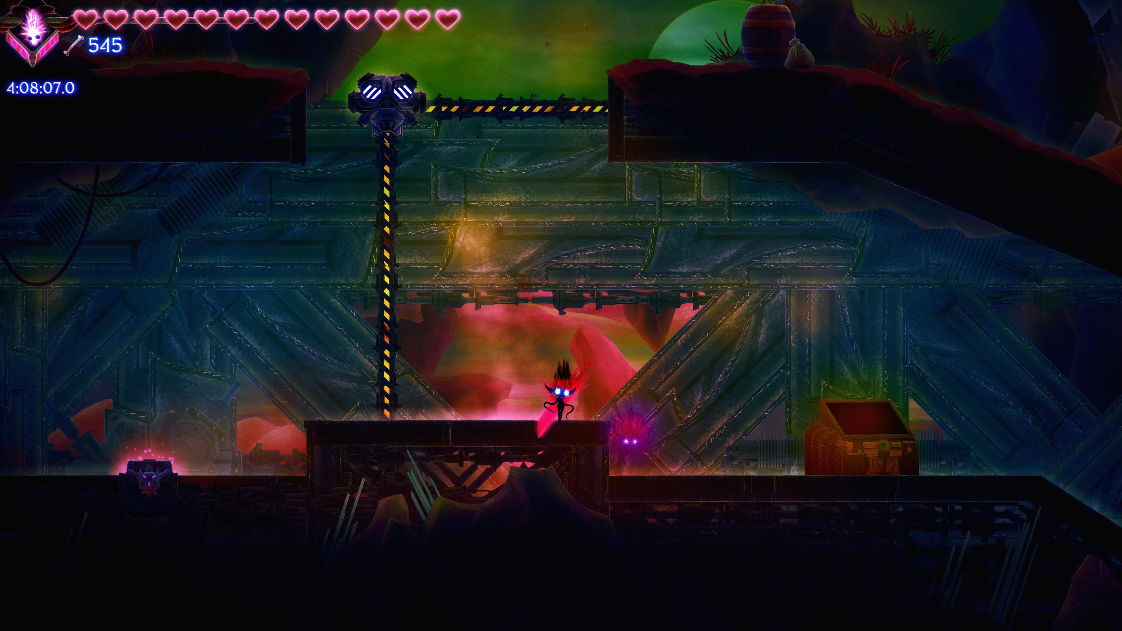
From the very beginning of the game's development, I wanted the game to have more detailed backgrounds than what is usually seen in other Metroidvanias. In most cases, the background is more simplistic and somewhat blurred. I wanted the background to have lots of detail to be able to create more environmental storytelling as well. This was obviously a great challenge, since the more detail there is, the harder it is to try to make all the important stuff pop out for the player to be able to see where to go. Quite often we had the idea of creating the characters with a slightly separate art style from the background, with outlines around them. This would have been a good choice and an easy one. But I wanted the game to be more immersive visually, so I thought the characters and the background should have the exact same visual style to make it “realistic,” which I think gives better immersion for the player visually. Then again, this was a challenge but it also motivated me. It was always awesome trying to figure out how to make things pop out using some little cues here and there. A good example of one of the things I ended up creating is the glow that is present on all of the walkable platforms. I think this works really well to give the needed interpretation in very detailed environments.
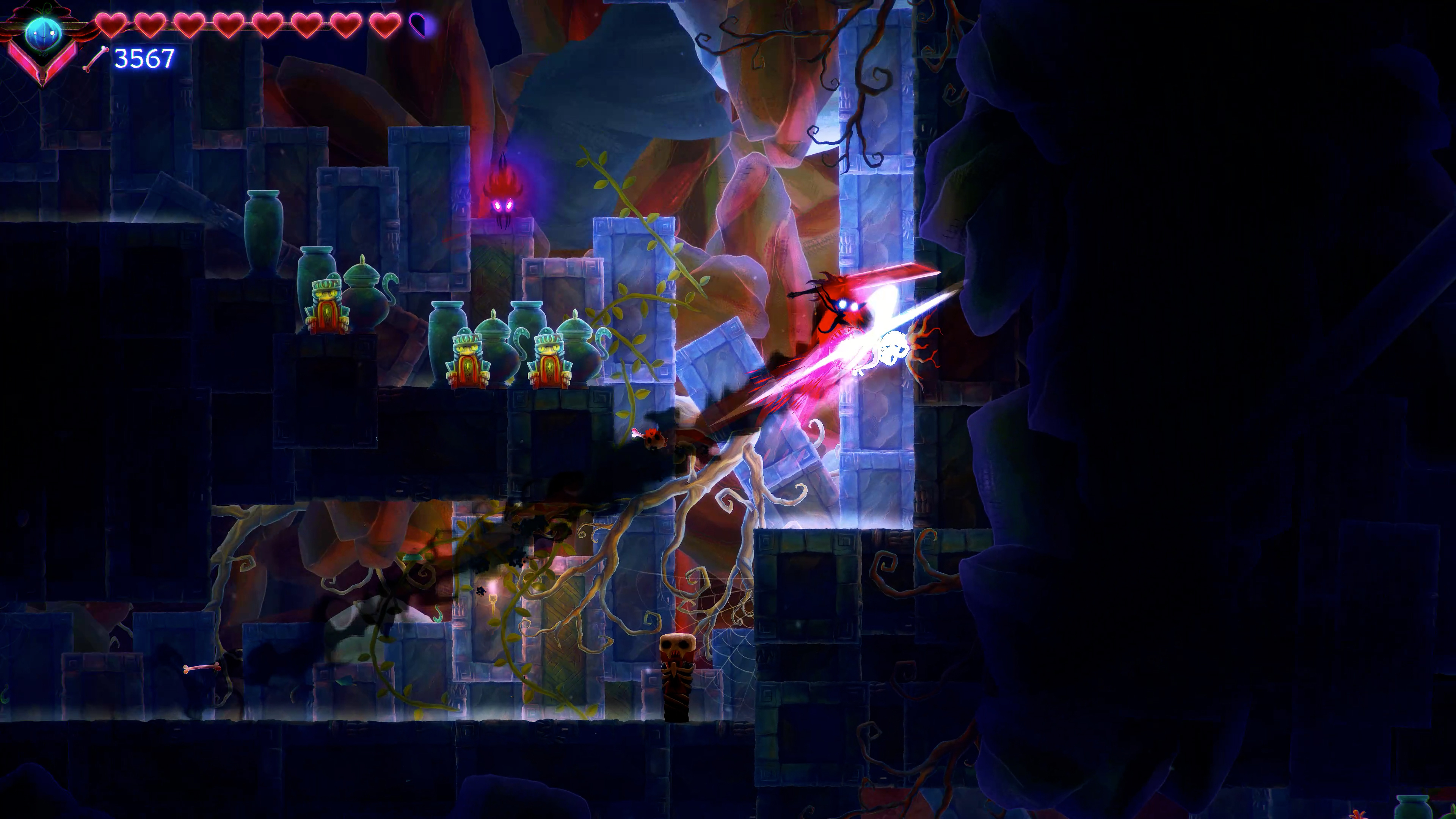
 All the platforms in the game have a glow on top to show players where they can walk on.
Personally, I think the art style of DOOMBLADE ended up looking super awesome and I’m really proud of it. We have had great feedback from players also noting certain issues with readability here and there - please keep the feedback coming! It really has helped us to develop the game further in all aspects! I hope you enjoy the visuals in DOOMBLADE as much as we do!
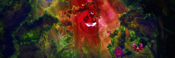
 So doomy, so gloomy!
We also pushed a small update today including the following two changes:
- Added a Mouse and Keyboard Recommended text element in the main menu which is displayed if a controller is being used to guide players towards the optimal experience.
- Added much requested guidance to late game for finding Gloomsouls. Once the Gloomsouls have been freed, talking to Voidchild in the Chapel of Doom will reveal the areas the souls can be found in.
Stay tuned for further updates and we greatly appreciate all of your support!

DOOMBLADE Iceberg Interactive